
Your First Listing Thumbnail: How to Maximize Click-Through Rate (CTR) and Outshine Competitors in 2026
You can engineer flawless SEO titles and configure all 13 tags with mathematical precision, but if your primary thumbnail image is blurry, cluttered, or washed out, prospective buyers will scroll right past in milliseconds without reading a single word. The defining visual truth in digital product e-commerce in 2026 is: Your primary listing thumbnail is the solitary gateway converting search impressions into qualified product clicks; deploying high-contrast staging paired with realistic contextual lifestyle mockups surges Click-Through Rate (CTR) by over 400%, signaling Etsy's search algorithm to boost your listing directly to Page 1.
💡 Core Takeaways from this Thumbnail Optimization Blueprint:
- The Search Grid Physics Matrix: Contrasting flat scans with high-contrast, lifestyle-staged presentation mockups.
- The 1-Second Mobile Glaze Test: Ensuring immediate cognitive clarity on smartphone screens.
- The 3 Golden Rules of High-Converting Thumbnails: Frame contrast, product density, and minimal text overlay.
- Pre-Flight Thumbnail Action Checklist: Operational quality standards to dominate competitive search grids.
1. Head-to-Head Search Grid Physics Matrix (2026)
| Primary Thumbnail Architecture | Visual Impact on Mobile Screen Grid | Baseline Click-Through Rate (CTR) | Algorithmic Search Trajectory |
|---|---|---|---|
| Flat Digital Scan on Pure White Background | Vanishes against Etsy's stark white UI backdrop | Low (< 0.8%) | Drops into deep search obscurity |
| Overcrowded Text Clutter & Chaos | Visually exhausting; resembles a spam banner | Moderate (1.5%) | Erratic, volatile placement |
| High-Contrast Contextual Lifestyle Mockup | Pops instantly; conveys overwhelming tangible value | Elite (4.2% - 5.8%) | Ascends to Page 1 with "Best Seller" badges |
2. The 3 Golden Rules of Magnetic Listing Thumbnails
1. The Background Contrast Imperative
- Because Etsy’s native search interface operates on a bright white background, always stage your deliverable against a warm, subtly contrasting surface (soft neutral cream, light organic wood, or gentle slate gray) so your product boundaries pop.
2. Contextual Lifestyle Presentation
- Never display a printable page as an isolated, flat PDF. Display coloring sheets beside realistic colored pencils, or stage digital planners rendered inside an iPad frame with a digital stylus. Tangible context bridges the intangible digital gap.
3. The "Two-Word Anchor" Rule
- Never copy your entire product title onto the image! Limit graphic overlays to high-utility value badges: “50 Pages”, “300 DPI Vector”, or “Instant Download” rendered in bold, clean typography.
3. The 1-Second Mobile Screen Glaze Test
- Over 70% of Etsy transactions occur on mobile devices.
- The Test: Shrink your thumbnail down to the size of a postage stamp on your mobile screen; if a shopper can identify the format, theme, and utility within 1 second, your image is primed for elite conversion velocity.
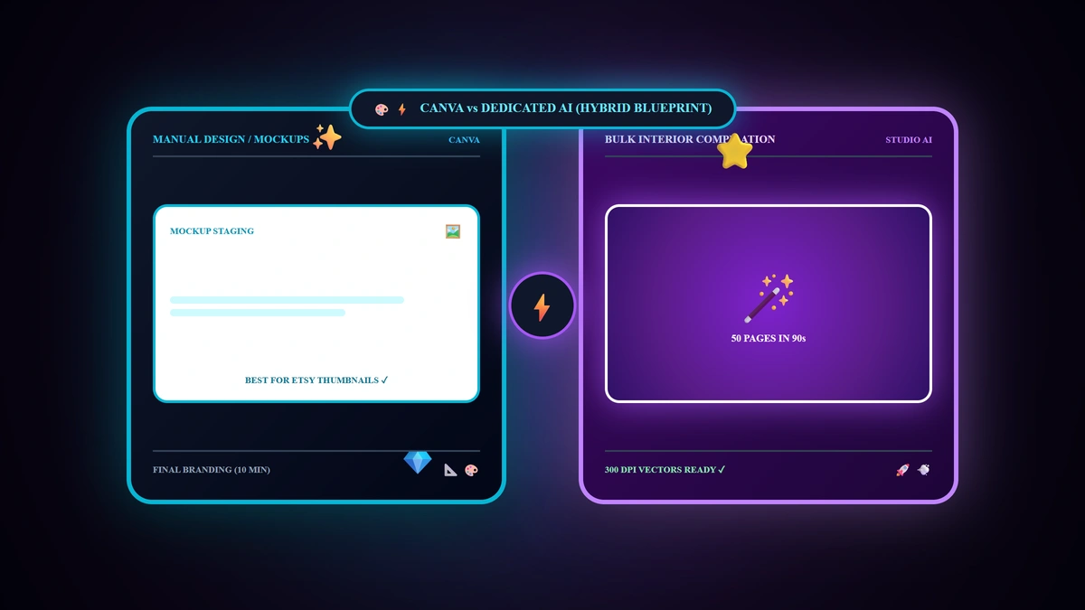
4. Accelerating Visual Polish with Specialized AI Generation
Utilizing dedicated generation platforms like Digital Products Maker, you can:
- Compile pristine 300 DPI vector interiors in 10 minutes.
- Export ultra-sharp layout previews engineered specifically for lifestyle mockup composition.
- Deploy high-contrast, premium thumbnails that command top-tier click-through rates from day one.
5. Primary Thumbnail Pre-Flight Action Checklist
- Export primary mockups at high resolution (2000x2000 px or standard 4:3 aspect ratio).
- Verify deliberate color contrast between your deliverable, the background canvas, and Etsy's white interface.
- Ensure the core product consumes 70% to 80% of total thumbnail canvas area (eliminate empty dead space).
- Apply concise, high-contrast value badges highlighting key benefits.
- Conduct the 1-second mobile test to confirm instant clarity at small thumbnail sizes.
6. Frequently Asked Questions (FAQ)
Can I change a listing's thumbnail if it is not getting clicks?
Yes! A/B testing alternative primary thumbnails is the single most effective lever professional sellers use to reignite stalled listings and capture new search traffic.
Should I use loud neon colors in my thumbnail background?
High contrast is essential, but harsh neon tones degrade perceived product value; opt for elegant, warm, aesthetic palettes that signal premium craftsmanship.
Does a higher Click-Through Rate (CTR) directly boost search ranking?
Yes! Etsy's search engine actively measures listing engagement; listings demonstrating superior CTR relative to impressions receive automated ranking priority in organic search results.
Summary and First Action Step
In digital commerce, your thumbnail is your storefront window. Invest deliberate care into staging a high-contrast, context-rich primary thumbnail that commands attention across crowded search grids, and transform search impressions into consistent, compounding sales in 2026.